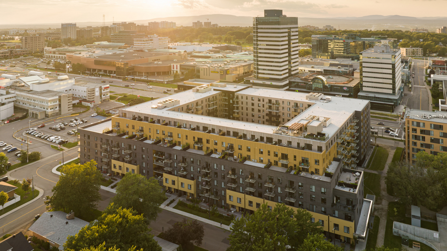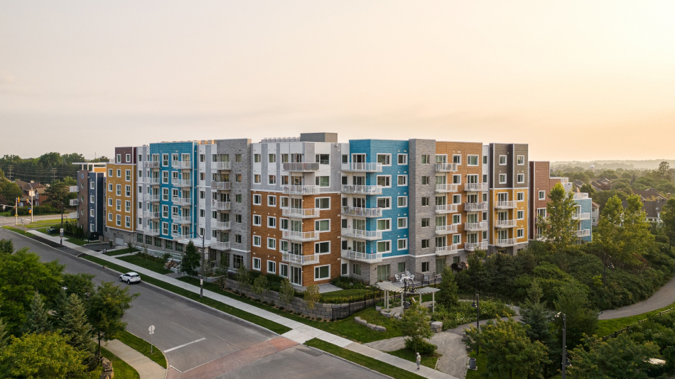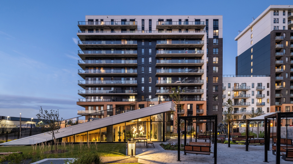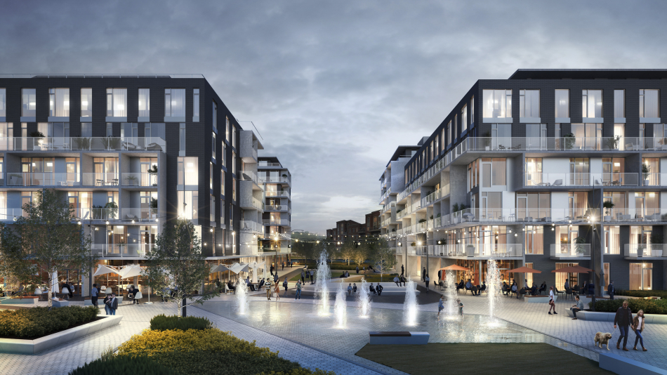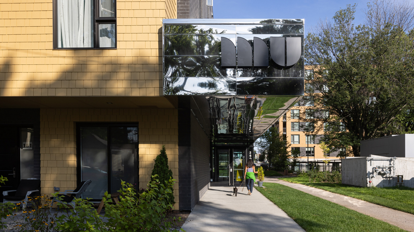
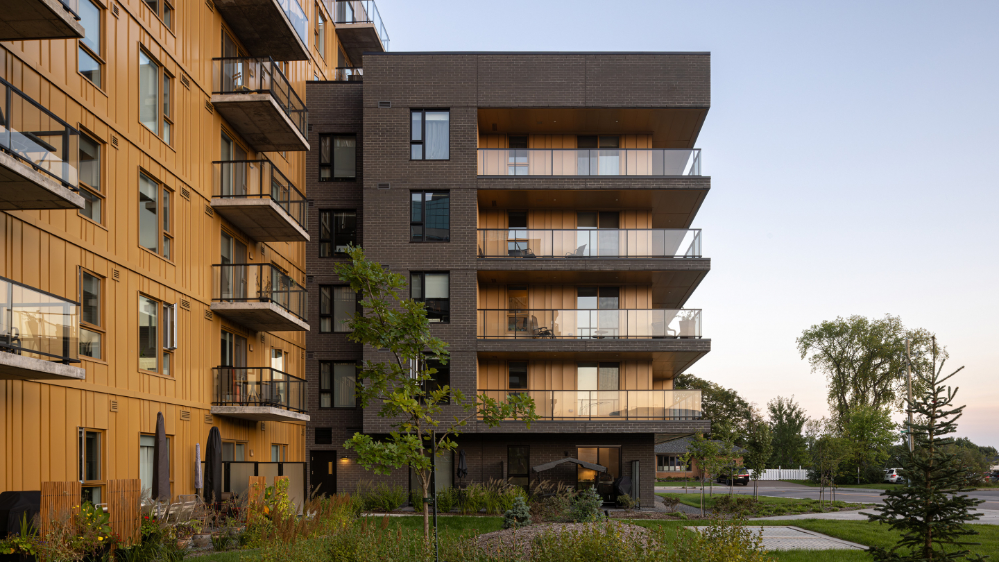
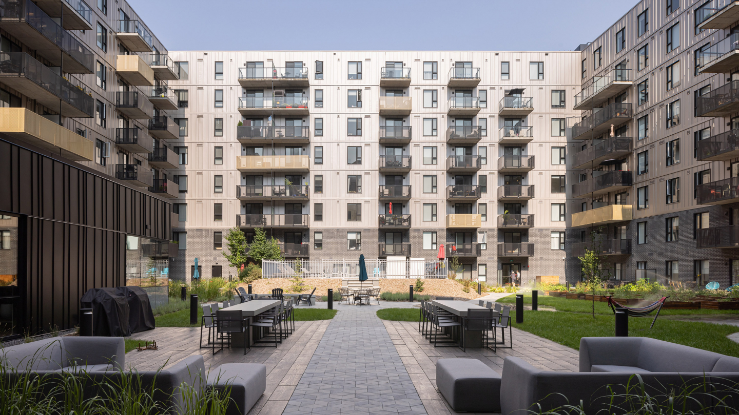
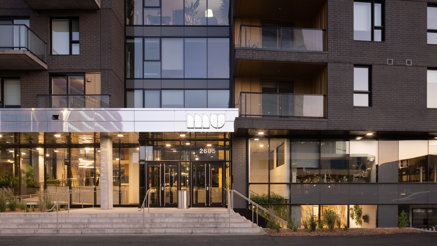
In close proximity to downtown Quebec City and the future tramway, the construction is built in line with the existing building frontage to delimit a landscaped inner courtyard. This specific volumetry ensures the densification of the block and provides all units with natural light. The articulation of the facades follows the neighboring massing. For example, setting back the top floors facing the single-family houses adapts human scale.
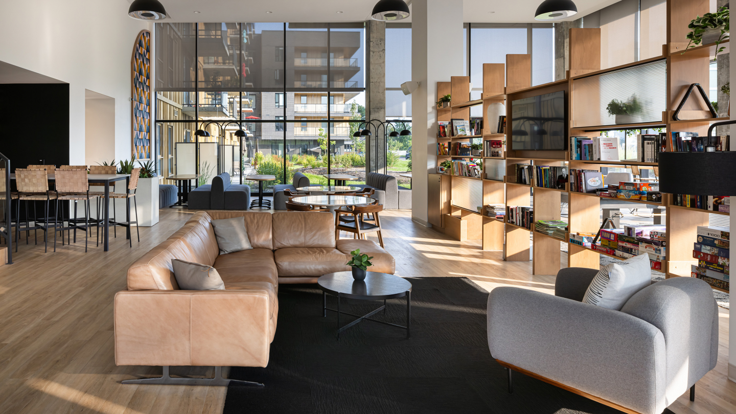
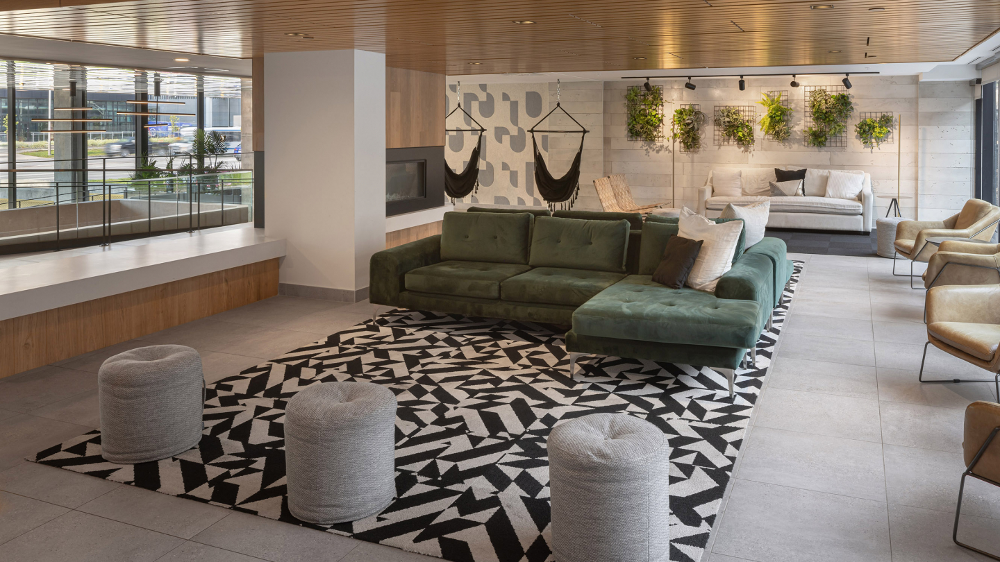
MU focuses on the Art & Music criterion of WELL accreditation through acoustic and colorimetric treatments of the common spaces: music diffusion in circulation areas, painting of parking spaces, and deployment of artworks by illustrator Roger throughout the residence. Particular attention to the integration of light and natural materials (wood, sisal, linen and leather) further enhances user well-being.
Branding and design were discussed with the client in order to give the project a consistent visual identity. Typography was created and used throughout the furniture and signage (arched shape of the mirrors, acoustic panels and tapestries). Vibrant colors (blue, pink and orange) liven up the common areas. A multiple and flexible programming encourages the creation of links between the different generations, from students to young retirees.
Crédit photo : Stéphane Groleau
